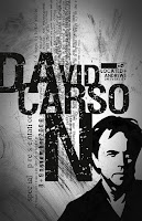
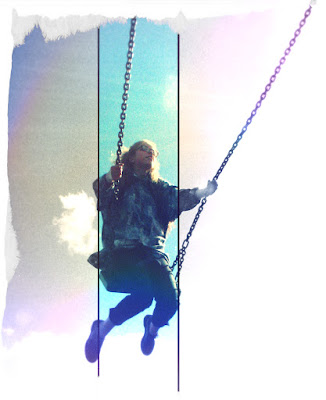
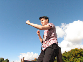
The most popular options from the questionnaire via a vote were:
IMAGE
Mid-shot/full body shot- An equal amount of people voted for a mid-shot or full body shot.
an Individual talent- Most people wanted an individual on the front cover
Do not care about the gender- There was only one vote for male and one vote for female; most people did not mind what gender the talent was
DESIGN
Non-cluttered- Slightly more people wanted a non-cluttered cover
Black, white and blue, dark and dull colours- These were the most popular colour options, closely followed by red and purple. More people wanted the colours to be dark and dull than light and bright
Sans serif font- The majority of people chose sans serif over serif and handwriting
MASTHEAD
At the top and to the left- This I was expecting, as this layout is the normal, conventional way to position the masthead
NAME SUGGESTIONS
- Broken Strings
- Innocent youth
- Sound Prism
- Colour Riff
- Siren
After looking at the suggestions I received, I have decided that 'Siren' is the most fitting and suitable name for my magazine. However I may make alterations.
I like this name suggestion because it fits the type of magazine I wanted to create and links to music (A siren being a mythical being that would lead sailors to their deaths by song). It has a dark tone to it, and will go nicely with my magazine.
I like this name suggestion because it fits the type of magazine I wanted to create and links to music (A siren being a mythical being that would lead sailors to their deaths by song). It has a dark tone to it, and will go nicely with my magazine.

